Inter Miami CF Brand Identity and badge design
Founded in 2018, Inter Miami CF is the first professional soccer club in Miami and the second professional club in Florida to join the MLS (Major League Soccer) in 2020. The team was established by an investment group led by former English football superstar David Beckham. From its inception, the club carried a legacy of excellence and was therefore committed to elevating the sport's presence in the United States. In order to do so, Inter Miami CF had to design a world class brand. To do so they hired Brooklyn based creative studio Doubleday & Cartwright that specializes in sports, art and culture related projects. Also have the experience working for big brand names like Nike, Apple and Red bull.
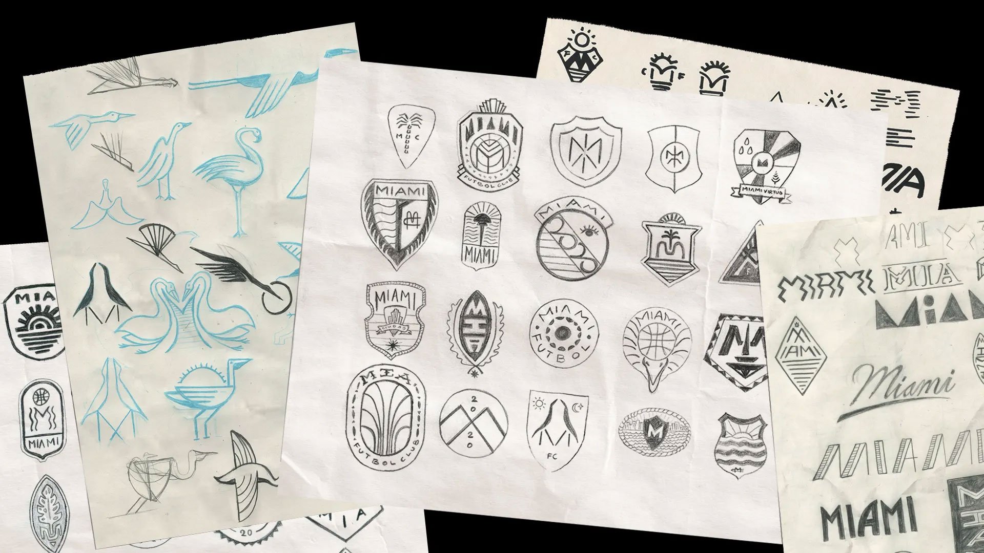
Image via maxamato.com
Naming:
The official name of the club is Inter Miami CF, which uses the “CF” abbreviation for Club de Fútbol to focus on the local Hispanic and Latino community in Miami. According to this U.S. Census, approximately 72.5% of Miami’s population is of Hispanic or Latino origins so it is makes sense why an MLS team would call themselves a Club de Fútbol.
Logo and Colors:
The Inter Miami CF's brand identity is a slick modern logo that weaves together the rich cultural heritage of Miami with the dynamic spirit of football. The team's crest features a shield with the Miami wordmark, two Great White Herons and eclipse. The Herons are unique to the region and their legs cross together to form the letter "M". The logo pays homage to the city's natural surroundings while symbolizing unity and collaboration. The color palette, composed of soft pink, black, and white, exudes sophistication and energy, capturing the essence of Miami's famed art deco influence, nightlife and diverse communities. This brand identity not only reflects the passion for soccer, but also encapsulates the allure and uniqueness of Miami itself, making Inter Miami CF a symbol of pride for both fans and the city's inhabitants. The team's home matches are played at the DRV PNK Stadium (Drive Pink initiative), packs an electrifying pink punch.
Video about the design and concept behind Inter Miami’s brand identity.
“We sent it to David (Beckham) and he liked the idea of a monogram inspired mark with a symbol that would represent the club.”
Image via intermiamicf.com


Despite the club’s slick new brand identity, Inter Miami CF have had difficulties getting the organization running properly. In 2021 the club was sanctioned and finned by the MLS for violating player cap regulations (read more about the sanctions here) and keep finding themselves at towards the bottom of the league standings. But from its inception, Inter Miami CF has always been committed to making a big impact on the MLS and on the world of soccer. This summer David Beckham and associates were successfully recruiting the World Cup winner and seven-time Ballon d’Or winner, Leo Messi (AKA the goat). Messi’s impact on the club was felt immediately. He has already lead Inter Miami CF to their first ever trophy by winning Leagues Cup final and has already scored 10 goals in just seven appearances for the club.
Project Credits:
Project: Inter Miami CF Brand Iden
Studio: Doubleday & Cartwright (link source)
Designer / Art Direction: Max Amato (link source)
Creative direction: Kimou Meyer & Pete Macia
Strategy: Kate Perkins and Dudley Versaci
Let us know what you think about Inter Miami’s brand identity in the comments below!